A wise man once said: “I’d rather be pissed off at my NFL team than to have no NFL team at all” – Keets.
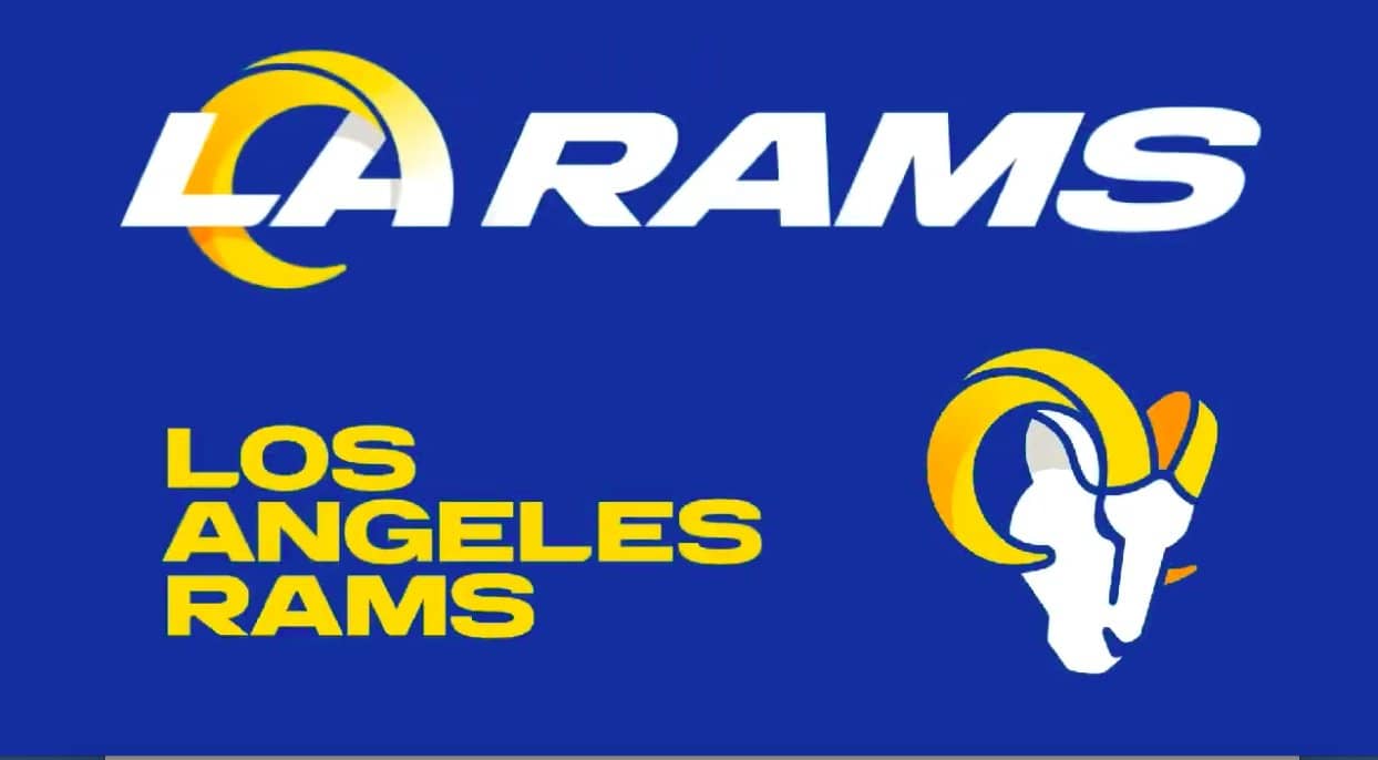
A couple weeks ago, the Rams logo was leaked on Reddit and made its way over to Twitter. At the time I had said that it looked what an old Chargers logo from the 90’s would look like, and I still hold that opinion. However, I was praying that this was fake and that it wasn’t, in fact, their actual logo that they planned to unveil ~today~. However, at 12pm PST, the Rams officially dropped their new logo on all of their social media accounts, where it was properly roasted.
Designer makes new Rams logo
Twitter: pic.twitter.com/v7XUUz2oHw
— 𝕁𝕠𝕤𝕙 👑 (@JordanPooleWrld) March 23, 2020
Browns: We have the worst logo in the NFL #ramslogo
Rams: pic.twitter.com/7dJhktH4S5
— Yoshi (@msuyoshi) March 23, 2020
the Rams officially unveiled their new logo
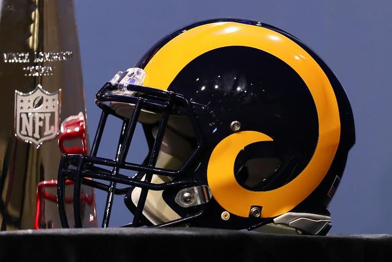
which means they got rid of the old Rams logo … which was shaped just like their new stadium 🤦♂️ pic.twitter.com/ETNNWUFLV4
— SB Nation (@SBNation) March 23, 2020
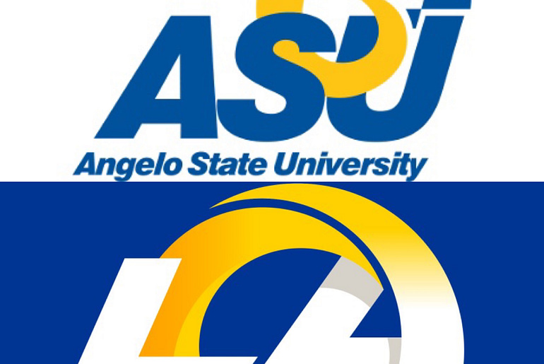
I know that a lot goes into rebranding an organization, but I’m really not sure what the Rams were thinking here. Like, did no one see that it clearly resembles the Chargers’ bolt? I kinda like the sleekness of the new lettering, but at the same time it looks lazy. It doesn’t strike me as an NFL logo, it’s more reminiscent of a Division 2 college in the middle of Texas. Wait. That’s because it is?? That’s right, the Rams basically stole their new logo from Angelo State University.
I guess the silver lining is that the Rams could possibly be in violation of the university’s copyright and would have to revert back to their old logo. Obviously someone in the Rams front office had to of seen Angelo State’s logo and based it off that, but why?? They’re the face of the NFL in Los Angeles (sorry Chargers), and the best they could do was copy a school whose marketing budget was probably 0.001% of what the Rams was? Just a sloppy job all around and truly a waste of getting my hopes up that we’d be greeted with some badass new logo. Here are the full collection of newly released logos:

And as if the reaction online wasn’t bad enough, the Rams’ Twitter went ahead and dropped a video detailing the uniform redesign that they plan to release as well. Seeing that Nike redesigned the uniforms puts my mind at ease a little because they rarely miss…but after the logo’s release I’m preparing for the worst.
As a Rams fan, it’s been a tough few days. They released Todd Gurley last Friday, and we were greeted with a disappointing logo today. If their brand new state-of-the-art stadium wasn’t in the works, I’m not sure there would be much to be excited for this year. The biggest positive to come out of this logo fiasco is that at least I’m able to talk about sports. It was a looong weekend of mostly binge-watching Westworld and trying to find girls I know on OnlyFans, so at least now I have some content for this damn site. Another positive: the Rams are 2/2 with the biggest stories to come out of the NFL in the past 3 days.
And as the internet always does…here are a couple redesigns that were put together in less than 10 minutes by a random Twitter account. If only the Rams had enlisted their help first.
Hey @RamsNFL, we did another. This one took 10 minutes! pic.twitter.com/gSX9Hew2Zc
— NFL Memes (@NFL_Memes) March 23, 2020
Los Angeles Rams Identity Concept
•••
Ram / LA / Wordmark
•••
Reworked the current mark so that the head creates an 'L', and the horn resembles an 'a.' I wanted to push this so that it wasn't literal but more of a hidden factor, letting the logo speak for itself. pic.twitter.com/3Ac4UcaSQ1— Dylan Winters (@DylanWintersCo) March 23, 2020


